ニフティでは CheesyKotlin という Kotlin の勉強会を、グループ会社のニフティライフスタイル株式会社と合同で行なっています。
今回は、2回にわたった Compose Animation の勉強会の総仕上げとして行なった Compose Animation 100本勝負 (※ 100本あるとは言っていない)を特別に公開します!
Compose Animation
Compose Animation について知るには公式ドキュメントがよくまとまっているので、参考にしてください。

上記サイト内のチートシートを日本語訳したので、100本勝負に挑む際に活用してください。

Compose Animation 100本勝負
事前に勉強会メンバーそれぞれが学んだ Compose Animation を活用してお題を考え、勉強会の時間内では、ランダムに指名された人が具体的な実装方法を1分で考えて発表します。その後、実際の実装方法を見ながら全員で一緒に答え合わせ・改善方法を考えることで Compose Animation のマスターを目指します!
デデン! T.S からの出題!
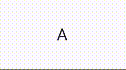
【お題】目押し可能なスロットを作りましょう!
【備考】
- ABCDEの文字をぐるぐる回してクリックで止める
ぼやき)スロットチックなアニメーションつけたかったなぁ
ヒント
-
infiniteTransitionを使いましょう
実装例
package com.example.animations
import android.util.Log
import androidx.compose.animation.core.*
import androidx.compose.foundation.clickable
import androidx.compose.foundation.layout.Column
import androidx.compose.material3.Text
import androidx.compose.runtime.*
import androidx.compose.ui.Modifier
@Composable
fun SlotMachine() {
val symbols = listOf(
"A",
"B",
"C",
"D",
"E"
)
//ループ状態の記憶用変数
val infiniteTransition = rememberInfiniteTransition()
var isButtonClicked by remember { mutableStateOf(false) }
var nowNumber by remember { mutableStateOf(0f) }
//アニメーションのループ設定
val symbolOffset = infiniteTransition.animateFloat(
initialValue = 0f,
targetValue = 4f,
animationSpec = infiniteRepeatable(
animation = tween(durationMillis = 1000, easing = LinearEasing),
repeatMode = RepeatMode.Restart
)
)
Column() {
Log.e("DEBUG","CurrentSymbolIndex: ${symbolOffset.value.toInt()}")
Text(
text = if (isButtonClicked) {
symbols[symbolOffset.value.toInt()]
} else {
symbols[nowNumber.toInt()]
},
modifier = Modifier.clickable {
nowNumber = symbolOffset.value
isButtonClicked = !isButtonClicked
}
)
}
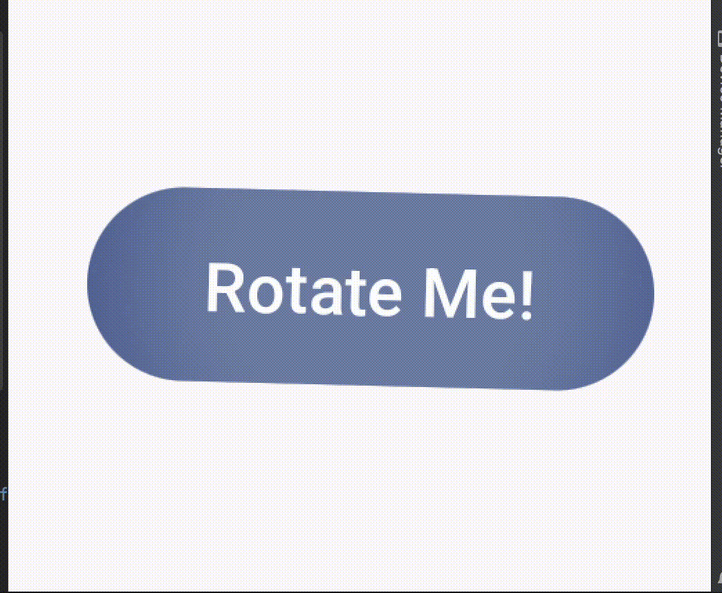
}デデン! I.N からの出題!
【お題】
【備考】
- ボタンを押すと回り始めて、2秒後にゆっくりと止まるのを無限に繰り返します。
- ボタンを押すとアニメーションは止まります
ヒント
-
無限に回すには
rememberInfiniteTransition()を使いましょう - tweenを使うと秒数でいい感じにやれます
- ButtonにgraphicLayerを使うと楽に回せます
実装例
package com.example.animations
import androidx.compose.animation.core.*
import androidx.compose.foundation.layout.Box
import androidx.compose.foundation.layout.fillMaxSize
import androidx.compose.material3.Button
import androidx.compose.material3.Text
import androidx.compose.runtime.*
import androidx.compose.ui.Alignment
import androidx.compose.ui.Modifier
import androidx.compose.ui.graphics.graphicsLayer
@Composable
fun RotatingButton() {
// 回転の状態を管理する変数
var continuousRotation by remember { mutableStateOf(0f) }
// アニメーションが進行中かどうかを管理する変数
var isAnimating by remember { mutableStateOf(false) }
val infiniteTransition = rememberInfiniteTransition()
val rotation by infiniteTransition.animateFloat(
initialValue = continuousRotation,
targetValue = continuousRotation + 360f,
animationSpec = infiniteRepeatable(
animation = tween(
durationMillis = 4000,
easing = FastOutSlowInEasing
),
repeatMode = RepeatMode.Restart
)
)
LaunchedEffect(isAnimating) {
if (isAnimating) {
continuousRotation += 360f
}
}
Box(
modifier = Modifier.fillMaxSize(),
contentAlignment = Alignment.Center
) {
Button(
onClick = {
isAnimating = !isAnimating // アニメーション状態を切り替える
},
modifier = Modifier.graphicsLayer(
rotationZ = if (isAnimating) rotation else continuousRotation // 回転角度を適用
)
) {
Text("Rotate Me!")
}
}
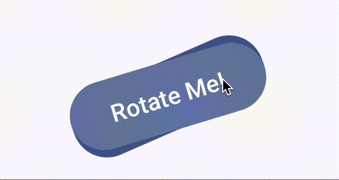
}デデン! R.S からの出題!
【お題】
【備考】
- 箱がぐぃ〜んと動く
ヒント
- 高さが0.dpの時, 幅が300.dp
- 幅が0.dpの時, 高さが300.dp
実装例
val infiniteTransition = rememberInfiniteTransition()
val state by infiniteTransition.animateFloat(
    initialValue = 0F,
    targetValue = 300F,
    animationSpec = infiniteRepeatable(
        animation = tween(1000, easing = LinearEasing),
        repeatMode = RepeatMode.Reverse
    )
)Box(
Modifier
.width(state.dp)
.height(300.dp - state.dp)
.background(
color = Color.LightGray
)
)デデン! K.S からの出題!
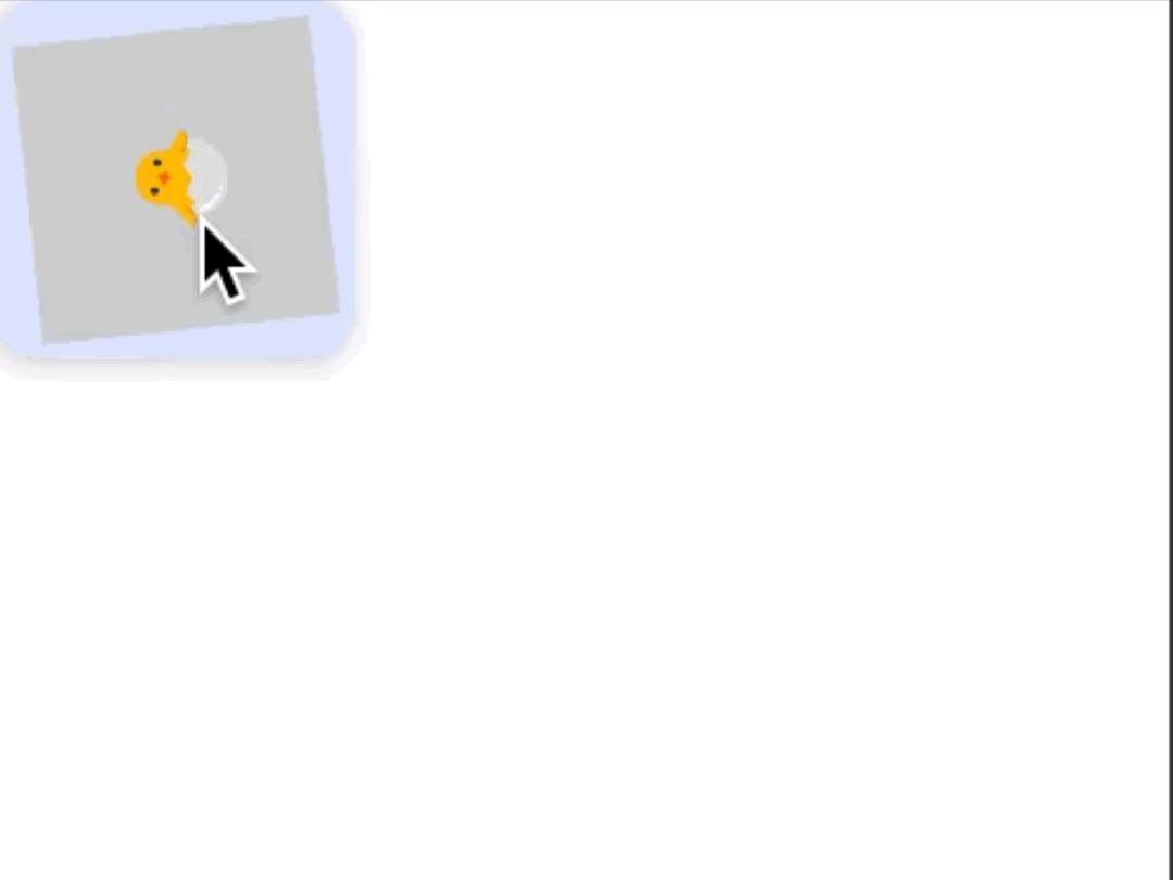
【お題】
【備考】
- BOXの中にBOXがいる
- 内側のBOXは大きさ固定で、常にぐるぐる回転してる(真ん中に何か動物)
- (内側を含めて)BOXのいずれかをタップするとどんどん大きくなる
ヒント
-
AnimateAsStateAnimationを使うよ! -
RememberInfiniteTransitionAnimationを使うよ!
実装例
// 呼び出し側
val infiniteTransition = rememberInfiniteTransition()
val innerState by infiniteTransition.animateFloat(
    initialValue = 0F,
    targetValue = 360F,
    animationSpec = infiniteRepeatable(
        animation = tween(1000, easing = LinearEasing),
        repeatMode = RepeatMode.Reverse
    )
)
var outerState by remember { mutableStateOf(100) }
val size: Dp by animateDpAsState(targetValue = outerState.dp)

ComposeAnimationTheme {
    Surface(
        modifier = Modifier.fillMaxSize(),
        color = MaterialTheme.colorScheme.background
    ) {
        Column(modifier = Modifier.fillMaxSize()) {
            FloatingActionButton(onClick = {
                if( outerState >= 400 ) {
                    outerState = 100
                } else {
                    outerState += 20
                }
            }) {
                AnimateAsStateAnimation(state = innerState, size = size)
            }
        }
    }
}

// Composse側
@Composable
fun ComposeAnimation(
    state: Float,
    size: Dp
){
    Box(
        modifier = Modifier
            .animateContentSize()
            .width(size)
            .height(size),
        contentAlignment = Alignment.Center
    ) {
        Box(
            Modifier
                .rotate(state)
                .width(100.dp)
                .height(100.dp)
                .background(
                    color = Color.LightGray
                ),
            contentAlignment = Alignment.Center
        ){
            Text(text = "🐣", fontSize = 30.sp)
        }
    }
}
デデン! T.S からの出題!
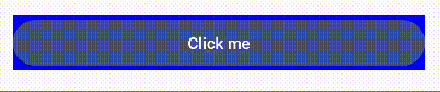
【お題】ボタンの色を徐々に変化させるアニメーションを作ろう!
【備考】
- 赤⇨青に相互に入れ替わっていくような感じで
ヒント
- animateColorAsStateなどを使いましょう
実装例
@Composable
fun ColorChangingButton() {
    var isButtonClicked by remember { mutableStateOf(false) }
    val color by animateColorAsState(
        targetValue = if (isButtonClicked) Color.Red else Color.Blue,
        animationSpec = tween(
            durationMillis = 1000,
            easing = LinearEasing
        )
    )

    Button(
        onClick = {
            isButtonClicked = !isButtonClicked
        },
        modifier = Modifier
            .fillMaxWidth()
            .padding(16.dp)
            .background(color)
    ) {
        Text(text = "Click me")
    }
}
デデン! I.N からの出題!
【お題】

【備考】
- 順番にテキスト現れて消えてを繰り返します
ヒント
- animatable, animateToを用います
- だんだん早く・遅くみたいなのはtweenを使うとだいたい上手くいきます
実装例
import androidx.compose.animation.core.*
import androidx.compose.foundation.layout.*
import androidx.compose.material3.Text
import androidx.compose.runtime.*
import androidx.compose.ui.Alignment
import androidx.compose.ui.Modifier
import androidx.compose.ui.draw.alpha
import androidx.compose.ui.unit.dp
import kotlinx.coroutines.delay
@Composable
fun TextAnimation() {
val texts = listOf("テキスト1", "テキスト2", "テキスト3")
val animatables = remember { texts.map { Animatable(0f, 0f) } }
LaunchedEffect(true) {
while (true) { // 無限ループでアニメーションを繰り返す
animatables.forEach { animatable ->
animateAlpha(animatable, targetValue = 1f)
}
animatables.forEach { animatable ->
animateAlpha(animatable, targetValue = 0f)
}
}
}
Box(
modifier = Modifier
.fillMaxWidth()
.fillMaxHeight(),
contentAlignment = Alignment.Center
) {
Column(horizontalAlignment = Alignment.CenterHorizontally) {
texts.forEachIndexed { index, text ->
AnimatedText(animatables[index].value, text)
if (index < texts.size - 1) Spacer(modifier = Modifier.height(20.dp))
}
}
}
}
@Composable
fun AnimatedText(alpha: Float, text: String) {
Text(
modifier = Modifier.alpha(alpha),
text = text
)
}
suspend fun animateAlpha(animatable: Animatable<Float, AnimationVector1D>, targetValue: Float) {
animatable.animateTo(
targetValue = targetValue,
animationSpec = tween(durationMillis = 500)
)
delay(100)
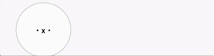
}デデン! R.M からの出題!
【お題】
【備考】
- ボタンを押すと画面の反対側に逃げます
ヒント
-
animateDpAsStateでModifier.offsetの値を変えてます
実装例
// sample4用
var state9 by remember { mutableStateOf(30) }
val position: Dp by animateDpAsState(targetValue = state9.dp)

// ...

Button(
    onClick = {if(state9<250) state9+=250 else state9-=250},
    modifier = Modifier
        .offset(x = position, y = 10.dp)
        .size(100.dp),
    shape = CircleShape,
    colors = ButtonDefaults.buttonColors(containerColor = Color.White, contentColor = Color.Black),
    border = BorderStroke(1.dp, Color.LightGray),
    contentPadding = PaddingValues(0.dp)
){
    Text(text = "・x・")
}
デデン! T.H からの出題!

【備考】
- プラスを押すとインクリメント、マイナスを押すとデクリメント
- 数字がスライドする
実装例
@ExperimentalAnimationApi
@Composable
fun Sample(
    state: Int,
    onClickPlusButton: () -> Unit,
    onClickMinusButton: () -> Unit,
    ) {
    Column {
        AnimatedContent(
            targetState = state,
            transitionSpec = {
                val isPlus = targetState > initialState
                if (isPlus) {
                    slideInHorizontally { width -> width } + fadeIn() with slideOutHorizontally { width -> -width } + fadeOut()
                } else {
                    slideInHorizontally { width -> -width } + fadeIn() with slideOutHorizontally { width -> width } + fadeOut()
                }
            }
        ) { targetCount ->
            Text(
                text = "$targetCount",
                textAlign = TextAlign.Center,
                style = MaterialTheme.typography.bodyLarge,
                modifier = Modifier.fillMaxWidth()
            )
        }

        Row(modifier = Modifier.fillMaxWidth(), horizontalArrangement = Arrangement.Center) {
            Button(onClick = onClickPlusButton) {
                Text("PLUS")
            }

            Button(onClick = onClickMinusButton) {
                Text("MINUS")
            }
        }
    }
}

var state by remember {
	mutableStateOf(0)
}

Sample(
	state = state,
	onClickPlusButton = { state++ },
	onClickMinusButton = { state-- }
)
デデン! I.N からの出題!
【お題】
【備考】
-
回るボタンに残像っぽいものをつける
- もっとかっこよく残像つけられる場合はそれで
ヒント
- 回るボタンは下の答えを見てください
-
val rotationHistory = remember{mutableListOf<Float>()}のような変数を用意し、rotationHistoryに従ってボタンを複数レンダリングするようにします- 全部レンダリングすると残像感薄れるので、レンダリングする時に間引きする
実装例
package com.example.animations
import androidx.compose.animation.core.*
import androidx.compose.foundation.layout.Box
import androidx.compose.foundation.layout.fillMaxHeight
import androidx.compose.foundation.layout.fillMaxWidth
import androidx.compose.material3.Button
import androidx.compose.material3.Text
import androidx.compose.runtime.*
import androidx.compose.ui.Alignment
import androidx.compose.ui.Modifier
import androidx.compose.ui.graphics.graphicsLayer
import androidx.compose.ui.graphics.Color
@Composable
fun RotatingEffectButton() {
var isAnimating by remember { mutableStateOf(false) }
val rotationHistory = remember { mutableListOf<Float>() }
val infiniteTransition = rememberInfiniteTransition()
val rotation by infiniteTransition.animateFloat(
initialValue = 0f,
targetValue = 360f,
animationSpec = infiniteRepeatable(
animation = tween(
durationMillis = 4000,
easing = FastOutSlowInEasing
),
repeatMode = RepeatMode.Restart
)
)
LaunchedEffect(isAnimating, rotation) {
if (isAnimating) {
rotationHistory.add(rotation)
// 保持する履歴の数を制限する(ここでは最後の20個)
if (rotationHistory.size > 10) {
rotationHistory.removeFirst()
}
} else {
rotationHistory.clear()
}
}
Box(
modifier = Modifier
.fillMaxWidth()
.fillMaxHeight(),
contentAlignment = Alignment.Center
) {
// 残像をレンダリング
rotationHistory.forEachIndexed { index, rotationValue ->
if (index % 2 == 0) {
val alpha = 1f - (index * 0.1f)
Button(
onClick = { /* 何もしない */ },
modifier = Modifier.graphicsLayer(
rotationZ = rotationValue,
alpha = alpha // 透明度を設定
)
) {
Text("Rotate Me!", color = Color.White.copy(alpha = alpha))
}
}
}
// 実際のクリッカブルなボタン
Button(
onClick = {
isAnimating = !isAnimating // アニメーション状態を切り替える
},
modifier = Modifier.graphicsLayer(
rotationZ = if (isAnimating) rotation else 0f // 回転角度を適用
)
) {
Text("Rotate Me!")
}
}
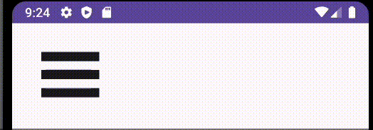
}デデン! L.L からの出題!
【お題】
【備考】
- 押したら ❌ に変わる ぷにゅぷにゅ のハンバーガーメニュー
ヒント
-
ハンバーガーのクラウン(上の線)とヒール(下の線)が ❌ の二本線になる、効果は
Modifier.graphicsLayerのrotationZとtransformOriginで定義できる -
ハンバーガーの肉(真ん中の線)は
true/falseによる表示する -
ぷにゅぷにゅ
アニメーションは
SpringSpec<Float>を使う
実装例
package com.example.animations

import androidx.compose.animation.core.SpringSpec
import androidx.compose.animation.core.animateFloatAsState
import androidx.compose.animation.core.spring
import androidx.compose.foundation.background
import androidx.compose.foundation.clickable
import androidx.compose.foundation.layout.Arrangement
import androidx.compose.foundation.layout.Box
import androidx.compose.foundation.layout.Column
import androidx.compose.foundation.layout.height
import androidx.compose.foundation.layout.padding
import androidx.compose.foundation.layout.width
import androidx.compose.foundation.shape.RoundedCornerShape
import androidx.compose.material3.MaterialTheme
import androidx.compose.material3.Surface
import androidx.compose.runtime.Composable
import androidx.compose.runtime.getValue
import androidx.compose.runtime.mutableStateOf
import androidx.compose.runtime.remember
import androidx.compose.runtime.setValue
import androidx.compose.ui.Alignment
import androidx.compose.ui.Modifier
import androidx.compose.ui.graphics.TransformOrigin
import androidx.compose.ui.graphics.graphicsLayer
import androidx.compose.ui.unit.dp

@Composable
fun HamburgerMenuAnimation() {
    Surface(Modifier.background(MaterialTheme.colorScheme.background)) {

        var isRotated by remember {
            mutableStateOf(false)
        }
        var isHidden by remember {
            mutableStateOf(false)
        }

        val rotateTop by animateFloatAsState(
            targetValue = if (isRotated) 48f else 0f,
            animationSpec = springSpec(),
            label = "top",
        )
        val rotateBottom by animateFloatAsState(
            targetValue = if (isRotated) -48f else 0f,
            animationSpec = springSpec(),
            label = "bottom",
        )
        val hideCenter by animateFloatAsState(
            targetValue = if (isHidden) 0f else 1f,
            animationSpec = springSpec(),
            label = "center",
        )

        Column() {
            Column(
                modifier = Modifier
                    .align(Alignment.CenterHorizontally)
                    .padding(32.dp)
                    .height(if(isHidden) 40.dp else 50.dp)
                    .clickable {
                        isRotated = !isRotated
                        isHidden = !isHidden
                    },
                verticalArrangement = if (isHidden) Arrangement.SpaceAround else Arrangement.SpaceBetween
            ) {
                // 上の線
                Box(
                    modifier = Modifier
                        .graphicsLayer(
                            shape = RoundedCornerShape(8.dp),
                            rotationZ = rotateTop,
                            transformOrigin = TransformOrigin(pivotFractionX = 0.3f, pivotFractionY = 0.3f)
                        )
                        .width(64.dp)
                        .height(10.dp)
                        .background(color = MaterialTheme.colorScheme.onBackground)
                )

                // 真ん中の線
                if (!isHidden) {
                    Box(
                        modifier = Modifier
                            .graphicsLayer(
                                shape = RoundedCornerShape(8.dp),
                                scaleX = hideCenter, scaleY = hideCenter, alpha = hideCenter
                            )
                            .width(64.dp)
                            .height(10.dp)
                            .background(color = MaterialTheme.colorScheme.onBackground)
                    )
                }

                // 下の線
                Box(
                    modifier = Modifier
                        .graphicsLayer(
                            shape = RoundedCornerShape(8.dp),
                            rotationZ = rotateBottom,
                            transformOrigin = TransformOrigin(pivotFractionX = 0.3f, pivotFractionY = 0.3f)
                        )
                        .width(64.dp)
                        .height(10.dp)
                        .background(color = MaterialTheme.colorScheme.onBackground)
                )
            }
        }
    }
}

@Composable
private fun springSpec(): SpringSpec<Float> =
    spring(dampingRatio = 0.35f, stiffness = 300f)
デデン! R.M からの出題!
【お題】
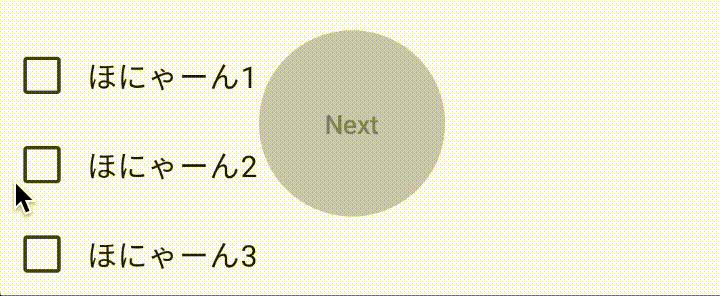
【備考】
- チェックボックスの進度に合わせてインジケータが動き、全てチェックされるとボタンがclickableになり色も変わる
ヒント
-
CircularProgressIndicatorを使う - ボタンのdisable→ableの切り替え時に背景色をいい感じに切り替えるには、背景色もアニメーションとして別途用意する
- buttonにはデフォルトでpaddingがついているので、中央よせするには余白を消す
実装例
package com.example.animations

import androidx.compose.animation.animateColor
import androidx.compose.animation.core.Transition
import androidx.compose.animation.core.animateFloat
import androidx.compose.foundation.layout.Box
import androidx.compose.foundation.layout.PaddingValues
import androidx.compose.foundation.layout.fillMaxSize
import androidx.compose.foundation.layout.size
import androidx.compose.foundation.shape.CircleShape
import androidx.compose.material3.Button
import androidx.compose.material3.ButtonDefaults
import androidx.compose.material3.CircularProgressIndicator
import androidx.compose.material3.MaterialTheme
import androidx.compose.material3.Text
import androidx.compose.runtime.Composable
import androidx.compose.runtime.getValue
import androidx.compose.ui.Alignment
import androidx.compose.ui.Modifier
import androidx.compose.ui.graphics.Color
import androidx.compose.ui.unit.dp

@Composable
fun Sample3(
    state: Transition<Float>
){
    val process by state.animateFloat(label = "progress") {
        it
    }
    val color by state.animateColor(label = "color") {
        if(it>=1.0f) MaterialTheme.colorScheme.primary else Color.LightGray
    }
    Button(
        onClick = {},
        modifier = Modifier
            .size(100.dp),
        shape = CircleShape,
        colors = ButtonDefaults.buttonColors(disabledContainerColor = color, containerColor = color),
        enabled = process>=1.0f,
        contentPadding = PaddingValues(0.dp)
    ) {
        Box(
            modifier = Modifier.fillMaxSize(),
            contentAlignment = Alignment.Center
        ) {
            Text(text = "Next")
            CircularProgressIndicator(
                progress = process,
                modifier = Modifier
                    .size(100.dp),
            )
        }
    }
}
呼び出し側
var checkbox1 by remember { mutableStateOf(false) }
var checkbox2 by remember { mutableStateOf(false) }
var checkbox3 by remember { mutableStateOf(false) }
var checkedNum by remember { mutableStateOf(0) }
val state8 = updateTransition(targetState = checkedNum.toFloat() / 3)

// ...

Row {
    Column {
        Row(
            verticalAlignment = Alignment.CenterVertically
        ) {
            Checkbox(
                checked = checkbox1,
                onCheckedChange = {
                    checkbox1 = !checkbox1
                    if (checkbox1) checkedNum += 1 else checkedNum -= 1
                }
            )
            Text(text = "ほにゃーん1")
        }
        Row(
            verticalAlignment = Alignment.CenterVertically
        ) {
            Checkbox(
                checked = checkbox2,
                onCheckedChange = {
                    checkbox2 = !checkbox2
                    if (checkbox2) checkedNum += 1 else checkedNum -= 1
                }
            )
            Text(text = "ほにゃーん2")
        }
        Row(
            verticalAlignment = Alignment.CenterVertically
        ) {
            Checkbox(
                checked = checkbox3,
                onCheckedChange = {
                    checkbox3 = !checkbox3
                    if (checkbox3) checkedNum += 1 else checkedNum -= 1
                }
            )
            Text(text = "ほにゃーん3")
        }
    }
    Sample3(state = state8)
}
デデン! I.N からの出題!
【お題】
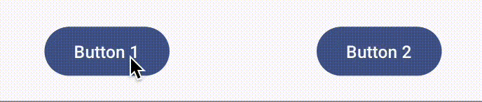
【備考】
- ボタンを押すと2つに分裂し、分裂したボタンを押すとまた1つに戻ります
ヒント
-
val offset by animateDpAsState(if (isOpen) 60.dpelse 0.dp)- なめらかな動きはanimateDpAsStateがいい感じにやってくれます
- 分裂しているように見えているだけで、実際には別のボタンを出してます
実装例
import androidx.compose.animation.core.animateDpAsState
import androidx.compose.foundation.layout.*
import androidx.compose.material3.Button
import androidx.compose.material3.Text
import androidx.compose.runtime.*
import androidx.compose.ui.Alignment
import androidx.compose.ui.Modifier
import androidx.compose.ui.unit.dp

@Composable
fun SplittingButton() {
    var isOpen by remember { mutableStateOf(false) }
    val offset by animateDpAsState(if (isOpen) 60.dp else 0.dp)

    Box(
        modifier = Modifier.fillMaxSize(),
        contentAlignment = Alignment.Center
    ) {
        if (!isOpen && offset < 20.dp) { // ここにoffset条件を追加することできれいに見える
            Button(onClick = { isOpen = true }) {
                Text("Click Me")
            }
        } else {
            Row(horizontalArrangement = Arrangement.Center) {
                Box(
                    Modifier
                        .offset(x = -offset)
                ) {
                    Button(onClick = { isOpen = false }) {
                        Text("Button 1")
                    }
                }

                Box(
                    Modifier
                        .offset(x = offset)
                ) {
                    Button(onClick = { isOpen = false }) {
                        Text("Button 2")
                    }
                }
            }
        }
    }
}
デデン! M.K からの出題!
【お題】

【備考】
- クリックすると弾む感じでサイズが変わりチェック状態になる、よくある感じのボタン
ヒント
-
Outlineの円は
Box、チェックはIcons.Filled.CheckCircleで表現できます -
updateTransitionでscaleの変化を定義します -
中身は
Crossfadeで変化しています
実装例
@Composable
fun CheckedButton(
    modifier: Modifier,
) {
    // 実際使うときは状態は外に出す
    var isChecked by remember { mutableStateOf(false) }
    val transition = updateTransition(isChecked, label = null)
    val scale by transition.animateFloat(label = "", transitionSpec = {
        keyframes {
            0.8f at 0 with FastOutSlowInEasing
            1.0f at 200 with FastOutSlowInEasing
            0.8f at 500 with FastOutSlowInEasing
        }
    }) { isChecked ->
        if (isChecked) 0.8f else 0.8f
    }

    Box(
        modifier = modifier
            .size(64.dp)
            .scale(scale)
            .border(
                BorderStroke(6.dp, Color.Green),
                CircleShape
            )
            .clip(CircleShape)
            .clickable {
                isChecked = !isChecked
            }
    ) {
        Crossfade(
            targetState = isChecked,
            label = "",
            animationSpec = tween(
                durationMillis = 200,
                easing = FastOutSlowInEasing
            )
        ) {
            when(it) {
                false -> {}
                true -> Icon(
                    imageVector = Icons.Filled.CheckCircle,
                    contentDescription = "",
                    modifier = modifier.size(64.dp),
                    tint = Color.Green
                )
            }
        }
    }
}
デデン! R.M からの出題!
【お題】
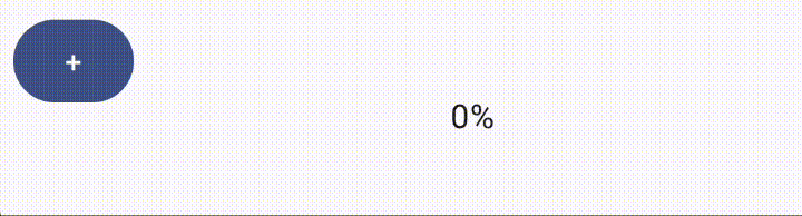
【備考】
- ボタンを押すとちょっとずつインジケーターが進行していき、100%になると色が変わる
ヒント
-
プログレスサークルには
CircularProgressIndicatorを使います -
値の進行と色が変わるということは・・・複数のアニメーションを持っている
-
UpdateTransitionを使ってます
-
実装例
package com.example.animations

import androidx.compose.animation.animateColor
import androidx.compose.animation.core.Transition
import androidx.compose.animation.core.animateFloat
import androidx.compose.foundation.layout.Box
import androidx.compose.foundation.layout.fillMaxSize
import androidx.compose.foundation.layout.size
import androidx.compose.material3.CircularProgressIndicator
import androidx.compose.material3.MaterialTheme
import androidx.compose.material3.Text
import androidx.compose.runtime.Composable
import androidx.compose.runtime.getValue
import androidx.compose.ui.Alignment
import androidx.compose.ui.Modifier
import androidx.compose.ui.graphics.Color
import androidx.compose.ui.unit.dp

@Composable
fun Sample2(
    state: Transition<Float>
){
    val process by state.animateFloat(label = "progress") {
        it
    }
    val color by state.animateColor(label = "color") {
        if(it>=1.0f) Color.Red else MaterialTheme.colorScheme.secondary
    }

    Box(modifier = Modifier.fillMaxSize(),
        contentAlignment = Alignment.Center
    ) {
        CircularProgressIndicator(
            modifier = Modifier
                .size(100.dp),
            progress = process,
            strokeWidth = 4.dp,
            color = color
        )
        Text(
            text = (process*100).toInt().toString()+"%"
        )
    }
}
呼び出し側
var state7 by remember { mutableStateOf(0f) }
val progress = updateTransition(targetState = state7)

// ...

Row {
    Spacer(modifier = Modifier.padding(4.dp))
    Button(
        onClick = {if(state7<=1.0f) state7 += 0.1f }
    ) {
        Text(text = "+")
    }
    Sample2(state = progress)
}
デデン! I.N からの出題!
【お題】
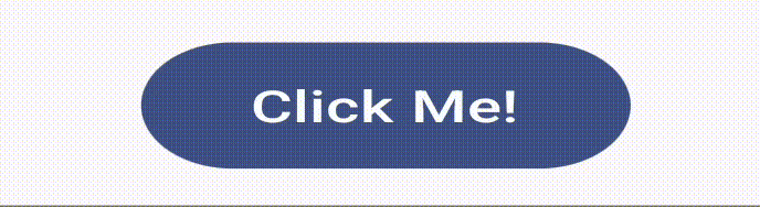
【備考】
- もちもちします
-
もちもちの計算が地味に難しいので、ヒントをみてください
-
ここからもらってきました
-
https://github.com/zk-phi/MEGAMOJI/blob/master/src/effects/motimoti.ts
(c) zk-phi / MIT License
-
https://github.com/zk-phi/MEGAMOJI/blob/master/src/effects/motimoti.ts
-
ここからもらってきました
ヒント
-
ratioとscaleOffsetを以下の式で計算し、scaleOffsetをgraphicLayerに適用します
val infiniteTransition = rememberInfiniteTransition()
val keyframe by infiniteTransition.animateFloat(
    initialValue = 0f,
    targetValue = 1f,
    animationSpec = infiniteRepeatable(
        animation = tween(1800, easing = LinearEasing),
        repeatMode = RepeatMode.Restart
    )
)

val ratio = sin(Math.PI * abs(keyframe - 0.5) / 0.5) / 4
val scaleOffset = Offset(ratio.toFloat(), (-ratio).toFloat())
実装例
import androidx.compose.animation.core.*
import androidx.compose.foundation.layout.Box
import androidx.compose.foundation.layout.fillMaxHeight
import androidx.compose.foundation.layout.fillMaxWidth
import androidx.compose.material3.*
import androidx.compose.runtime.*
import androidx.compose.ui.Alignment
import androidx.compose.ui.Modifier
import androidx.compose.ui.geometry.Offset
import androidx.compose.ui.graphics.graphicsLayer
import kotlin.math.abs
import kotlin.math.sin

@Composable
fun MotimotiButton(onClick: () -> Unit, content: @Composable () -> Unit) {
    val infiniteTransition = rememberInfiniteTransition()
    val keyframe by infiniteTransition.animateFloat(
        initialValue = 0f,
        targetValue = 1f,
        animationSpec = infiniteRepeatable(
            animation = tween(1800, easing = LinearEasing),
            repeatMode = RepeatMode.Restart
        )
    )

    val ratio = sin(Math.PI * abs(keyframe - 0.5) / 0.5) / 4
    val scaleOffset = Offset(ratio.toFloat(), (-ratio).toFloat())

    Box(
        modifier = Modifier
            .fillMaxWidth()
            .fillMaxHeight(),
        contentAlignment = Alignment.Center
    ) {
        Button(
            onClick = onClick,
            modifier = Modifier.graphicsLayer(
                scaleX = 1 + scaleOffset.x,
                scaleY = 1 + scaleOffset.y,
                translationX = -scaleOffset.x,
                translationY = scaleOffset.y
            )
        ) {
            content()
        }
    }
}
デデン! R.M からの出題!
【お題】
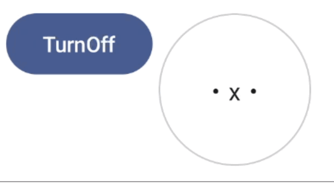
【備考】
- ボタンを押すと表示・非表示アニメーションが動きます
ヒント
-
AnimatedVisibility
- scaleIn/Out
- fadeIn/Out
- expandIn/shrinkOut
実装例
@OptIn(ExperimentalAnimationApi::class)
@Composable
fun Sample(
    visible: Boolean
) {
    AnimatedVisibility(
        visible = visible,
        enter = scaleIn(initialScale = 1f) + fadeIn(initialAlpha = 0.3f) + expandIn(),
        exit = scaleOut() + fadeOut() + shrinkOut(),
        modifier = Modifier.padding(4.dp)
    ) {
        Box(
            modifier = Modifier
                .animateContentSize()
                .size(100.dp)
                .clip(CircleShape)
                .background(color = Color.White)
                .border(width = 1.dp, shape = CircleShape, color = Color.LightGray),
            contentAlignment = Alignment.Center
        ) {
            Text(text = "・x・")
        }
    }
}var visible by remember {
mutableStateOf(true)
}
// ...
Row {
Spacer(modifier = Modifier.padding(4.dp))
Button(
onClick = {visible = !visible}
) {
if(visible) Text(text = "TurnOff") else Text(text = "TurnOn")
}
Sample(visible = visible)
}
どのくらい実装できたでしょうか?
ぜひとっておきのクイズを自分でも作ってみてください!